Whale Named Tampa Magazine’s 2025 Best Social Media/Marketing Agency – Two Years Running
Whale Named Tampa Magazine’s 2025 Best Social Media/Marketing Agency – Two Years Running
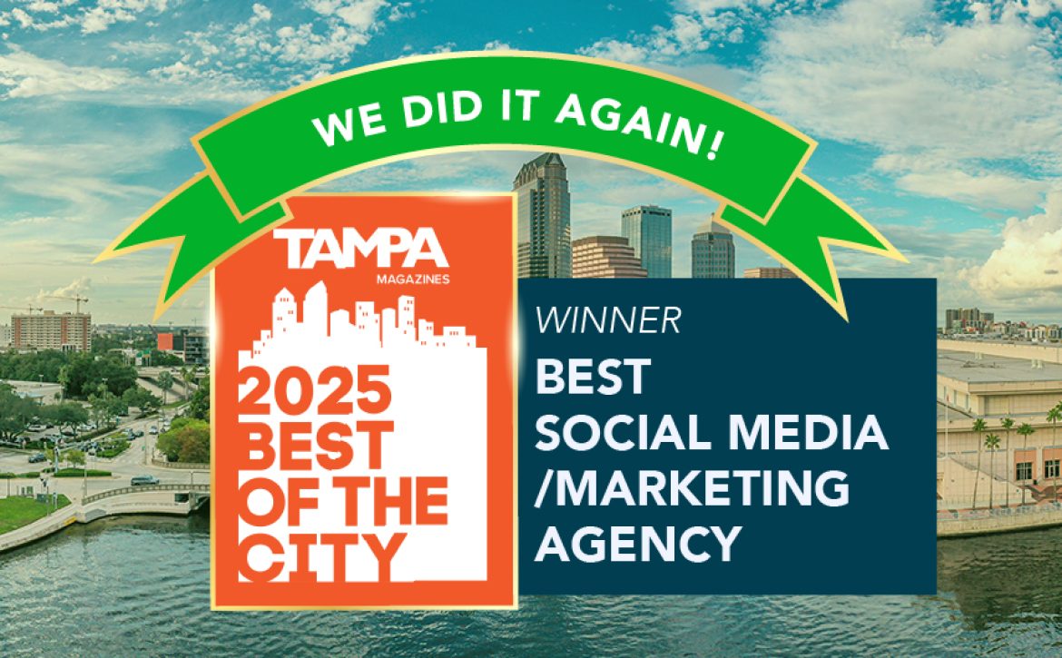
We are thrilled to announce that Whale has been named Tampa Magazine’s 2025 Best Social Media/Marketing Agency—for the second year in a row! 🎉
This recognition is not just an award, it’s a reflection of the incredible work our team has put in over the past year, and the trust our clients continue to place in us.
Expanding Into New Industries
In 2024, we set out to broaden our impact. Whale tapped into exciting new industries, partnering with clients across healthcare, contractors, banking, and emerging tech. Each new partnership challenged us to adapt and innovate, proving that strong marketing strategies transcend industries.
Growing The Whale Team
Our agency has grown, not just in client partnerships, but in people. We’ve welcomed new talent who bring fresh perspectives, creative energy, and specialized expertise. This growth has made us more agile and allowed us to scale the kind of personalized strategies our clients love us for.
Elevating Our Skill Set
Our team didn’t just grow in size—we grew in strength. Over the last year, Whale invested heavily in skill development, ensuring our team stays ahead of the curve in social media trends, analytics, branding, and performance marketing. From new certifications to hands-on training, our collective toolkit is sharper than ever.
Looking Ahead
Winning “Best Social Media/Marketing Agency” two years in a row is a huge honor, but for us, it’s fuel for the future. We’re committed to continuing our momentum, pushing boundaries, creating bold campaigns, and helping brands tell their stories in ways that connect and convert.
To our clients, community, and the Tampa Bay area: thank you for supporting Whale. Here’s to another year of growth, creativity, and making waves together. 🌊
Looking to take your marketing to the next level? Let Whale lead the way. Reach out to us today!